Blonda
MAR 2010
BRANDING & PACKAGING
Project for a Belgian cigarette brand. The brief was to have an authentic and retro Belgian design that would entice new customers through visually appealing graphics that demonstrate the product itself.
TECHNIQUE: Illustrator

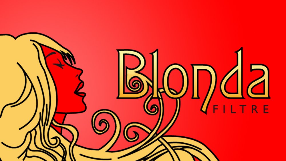
The Art Nouveau font chosen for the logo touched on the authentic and retro Belgian influence. The subtle golden gradient in the font symbolized the product itself.
#1 Logo

Packaging was for a pack of 25 cigarettes. The trick was to convey the same elements of Belgian influence on a small surface while still incorporating all of the necessary warning labels.
Each element had to be designed to maintain the feel of vintage Belgian vibe ad Art Nouveau.